

The Humanity Project was published by Plume (a Penguin imprint) in 2014. The Sky is Falling was published by Thomas Allen in 2010.
Do you notice anything about these two covers?
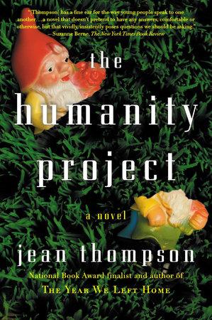
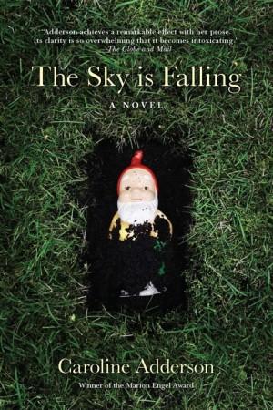
Could it be a coincidence that their book covers are so similar? Do garden gnomes in the grass mean something in the world of book cover design?
Book Covers have trends
RE Hawley writes:
What gets lost in the pivot toward safe, reliably marketable design in literary fiction is in many ways the same thing we risk losing to Amazon’s algorithmically-driven vision of readership—the thrill of encountering the unexpected, of being thrown from one’s course and wandering the bookstore with no idea what you might be looking for.
RE Hawley, PrintMag, Sept. 23, 2021
Yes, book covers give readers clues about content
Readers choose books for various reasons. Sometimes it’s a recommendation, or it’s in the right section at the bookstore, or they like the author’s other books. And sometimes, it’s got more to do with the cover, the blurb, and the placement in the store.
Whether you’re self-publishing or publishing traditionally, you will want a book cover that stands out, but not too much. But “not too much,” I mean that If it’s a romance you don’t want battling dragons on the cover. If it’s erotica, you don’t want a bicycle and flowerpots.
But I agree with Hawley 100%. Choosing “safe” book cover designs underestimates the capabilities of readers and traps designers in a cul-de-sac.
What do you think? Send me an email to psd[at]awritersroadmap[dot]com!